Bench answer
The reliable starting point
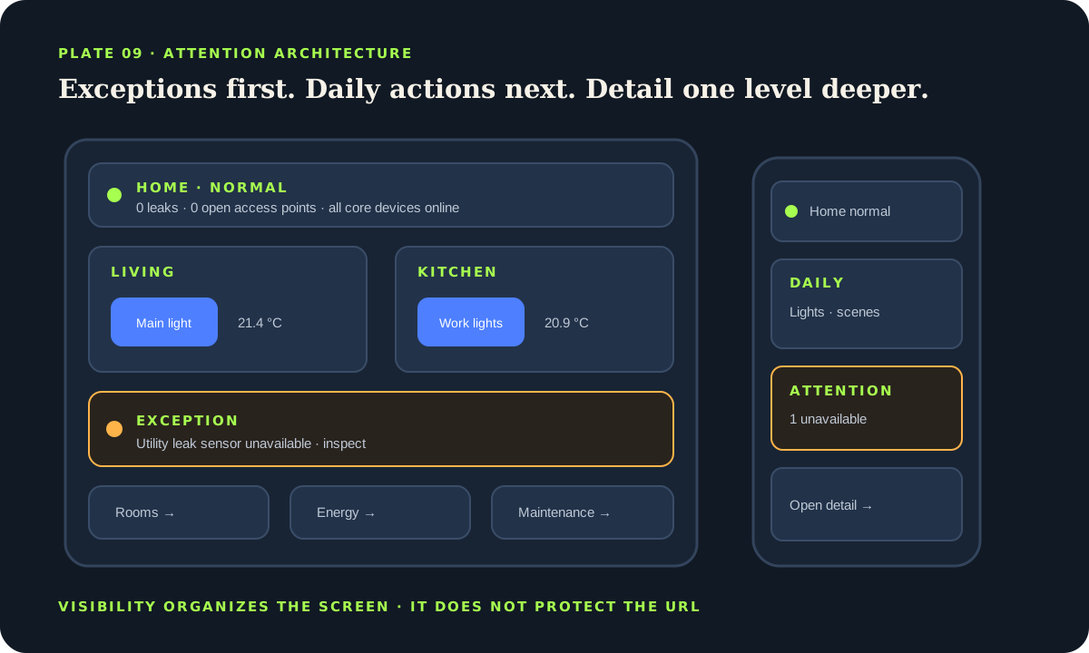
Build one custom dashboard for one audience. Start with the default Sections view, group cards by household task or area, use Tile cards for the few actions people perform every day, and reserve the first screen for exceptions such as open access points, active water alerts or unavailable critical devices. Prefer visible names over icon-only guessing, give destructive controls a confirmation step, and test on the smallest phone and the actual wall tablet. Visibility settings organize the interface; they do not secure the underlying URL or entity.
Define the audience and first five questions
A household overview, administrator console, kitchen tablet and guest panel serve different jobs. Write the five questions each audience asks most often: “Is anything open?”, “Which room needs attention?”, “Can I turn off downstairs?”, “What is the temperature?”, or “Where is the vacuum?” Build for those questions before choosing colors or cards.
Create a separate dashboard when the mental model or permission boundary changes materially. The default Home dashboard is useful for discovery, but an automatically growing entity inventory is rarely an effective daily surface. A custom dashboard lets names, areas, sections and actions stay deliberate as devices are added.
Use the language spoken in the home. “Hall lamp” is clearer than a manufacturer model or entity ID. Pair icons with visible labels for primary navigation; icon-only tabs depend on memory and tooltips that do not help a hurried person on a wall screen.
Use a calm three-level information architecture
The overview should show whole-home exceptions and the most common actions. Area views should hold ordinary room control. Detail subviews should contain history, configuration-adjacent information and less frequent diagnostics. Home Assistant subviews provide a back button and can be reached with a navigate action, which makes them useful for progressive disclosure without adding another permanent tab.
Keep the first mobile viewport meaningful. A compact status strip can show people, doors, leak state and energy exception, followed by two or three primary scenes or controls. Do not lead with decorative weather when an open garage or unavailable sensor is the decision that matters. Avoid repeating the same entity in several competing controls unless each placement has a clear purpose.
Sections are the default view type and provide a responsive grid with grouped cards and resizing. Masonry remains useful for flowing cards of varied height; Panel makes one card full width; Sidebar creates a wide and narrow column. Choose a layout from the content, then verify its reflow rather than forcing desktop geometry onto a phone.
Match cards and actions to consequence
Tile cards are a strong default in Sections because they combine state, label and optional features in a touch-friendly form. Heading cards establish groups; conditional cards reveal exceptions; history or statistics cards answer a defined trend question. Use entity or button cards when their simpler behavior is clearer. Every card should earn its space with an observation or action.
Distinguish navigation, inspection and control. A tap on a room heading can navigate. A tap on a sensor can open more information. A light tile can toggle only when an accidental tap is acceptable. For locks, doors, alarms, valves, heaters and broad “all off” actions, use a detail path or confirmation rather than an easy first-touch toggle. Preserve physical controls and manufacturer safeguards.
Do not make color the only state indicator. Combine state text, icon or shape with color, and maintain contrast in light and dark themes. Red should signal a defined exception, not simply decorate half the dashboard until users stop noticing it.
views:
  - title: Home
    type: sections
    sections:
      - type: grid
        cards:
          - type: heading
            heading: Living room
          - type: tile
            entity: light.living_main
            name: Main light
            tap_action:
action: more-infoTreat visibility as presentation, not authorization
Home Assistant can make views and cards visible to selected users or under conditions. This is excellent for reducing clutter and tailoring a tablet. The official view documentation warns that hiding a view only hides its tab; the URL remains accessible. Card visibility similarly should not be treated as access control for the entity or service behind it.
Use Home Assistant users, authentication, network design and integration capabilities for actual security boundaries. Do not expose an entity to a voice assistant or user merely because its card is hidden. A guest dashboard should contain only controls the account is permitted to use, not a cosmetically hidden administrator surface.
Design for thumbs, glare and modest hardware
Test at the narrowest supported phone width and in both orientations on the wall device. Primary targets should be comfortably tappable with space between consequential neighbors. A dashboard used from across a room needs larger labels and fewer choices than an administrator view used at a desk. Check sunlight, night brightness and screen burn-in behavior on the actual panel.
Keep the overview light. Many live camera streams, dense graphs, custom cards and animated backgrounds increase load and introduce more maintenance. Open media or long history in a subview. Prefer built-in cards first because their editor, responsive behavior and accessibility are maintained with Home Assistant. Add a custom card only when its value outweighs its update and compatibility cost.
Do not hide slow state reporting behind optimistic color. If a command is pending or an entity is unavailable, the interface should make uncertainty visible. A polished dashboard that confidently displays stale state is more dangerous than a plain one that says “unavailable.”
Run a household usability and failure test
Give a household member five realistic tasks without explaining the layout: turn off downstairs lights, find why the water alert is active, adjust one room, return from a detail view and identify an unavailable device. Watch where they hesitate. Rename and regroup before adding instructions. A dashboard that requires a guided tour every month has an information-architecture problem.
Then disconnect one integration, put the tablet offline, rotate it, enlarge browser text and use keyboard navigation on desktop. Verify that hidden content does not carry security assumptions. Export or record the dashboard configuration as part of the backup plan, and take screenshots of the intended layout before a major frontend update.
Dashboard acceptance checklist
- The first screen answers the audience’s highest-value questions.
- Primary controls have visible labels and safe tap behavior.
- Exceptions remain understandable without color alone.
- Phone, tablet, keyboard and unavailable states were tested.
- Visibility rules are not used as security boundaries.
Source desk
Primary documentation used for this guide. Interface names and behaviors can change; confirm the current page before changing a live installation.
- DashboardsOfficial dashboard concepts, visual editing and audience examples.Official source ↗
- Dashboard viewsOfficial layouts, subviews and the visibility security caveat.Official source ↗
- Dashboard cardsOfficial card categories, actions, visibility and resizing.Official source ↗
- SectionsOfficial responsive section editing and layout behavior.Official source ↗
Source review completed .
Frequent questions
Which Home Assistant dashboard layout should I start with?
Sections is the current default and a strong starting point for grouped, responsive cards. Choose Masonry, Panel or Sidebar only when their content model fits the view better.
Does hiding a view protect its URL?
No. Home Assistant documentation says view visibility hides the tab but the URL remains accessible. Use proper accounts, authentication and system permissions for security.
Are custom cards necessary for a premium dashboard?
No. Built-in Sections, Tile, Heading, Conditional and history cards can produce a clear professional interface with lower maintenance. Add a custom card only for a specific unmet need.
Should tapping a lock tile immediately unlock it?
Avoid easy first-touch actions for consequential devices. Navigate to a focused detail view, show fresh state and require deliberate confirmation while retaining physical safeguards.
How many cards belong on the overview?
There is no universal number. Include the few exceptions and everyday actions the audience needs in the first scan, then move room detail, trends and maintenance to views or subviews.